Creating the perfect ambiance in a hot pot restaurant involves careful consideration of color schemes. The right colors can enhance the dining experience, making customers feel welcome and comfortable. This guide covers the essential aspects of color selection for hot pot restaurant interiors, focusing on three key areas: warm and inviting hues, contrasting elements, and accent colors.
Warm and Inviting Hues
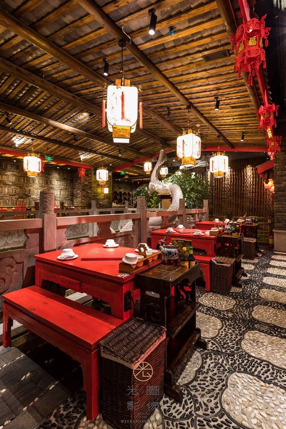
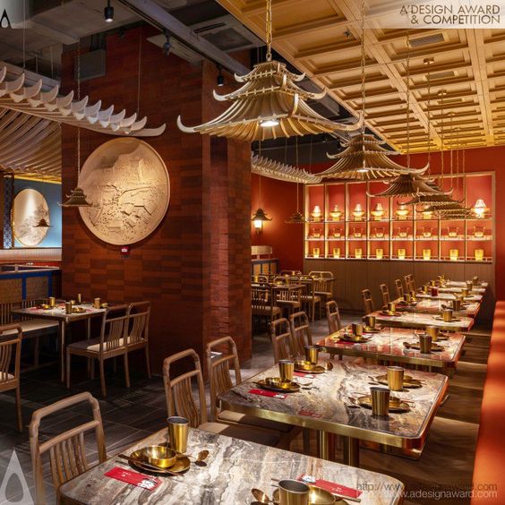
The foundation of any successful hot pot restaurant's color scheme should be warm and inviting hues. These colors create a cozy and welcoming atmosphere, encouraging diners to relax and enjoy their meals. Popular choices include shades of red, orange, and yellow. Red is particularly effective, as it is known to stimulate appetite and evoke feelings of warmth and comfort. Orange, with its energetic and cheerful vibes, complements red well, while yellow adds a touch of brightness and optimism. Combining these colors can create a vibrant yet harmonious environment that enhances the overall dining experience.
Contrasting Elements
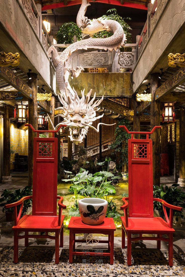
Incorporating contrasting elements into the color scheme is crucial for adding depth and interest to the restaurant's interior design. Balance warm hues with cooler tones like blues, greens, or neutral shades. For instance, pairing red walls with cool-toned furniture or accessories can create a striking visual contrast that prevents the space from feeling overwhelming. Similarly, using neutral colors such as beige, gray, or white can help tone down the intensity of warm hues, providing a sophisticated and modern look. This approach not only adds visual appeal but also ensures that the restaurant remains inviting and comfortable.
Accent Colors
Accent colors play a significant role in highlighting specific areas of the restaurant and creating focal points. Choose accent colors that complement the primary color scheme and add an extra layer of interest. For hot pot restaurants, gold and deep brown are excellent choices for accents. Gold accents can be used on fixtures, table settings, or decorative elements to add a touch of elegance and luxury. Deep brown, on the other hand, provides a grounded and earthy feel, perfect for creating a rustic and authentic ambiance. By thoughtfully incorporating accent colors, you can guide customers' attention and enhance the overall aesthetic appeal of the space.
In conclusion, designing the color scheme for a hot pot restaurant requires a careful balance of warm hues, contrasting elements, and accent colors. By focusing on these key areas, you can create an inviting and visually appealing environment that enhances the dining experience. Remember to consider the psychological effects of colors and how they interact with one another to ensure a harmonious and attractive interior.


